Why Precision Matters in Design & Dev
Modern digital design systems require seamless translation between design mockups created in Figma and production CSS code written in web applications. Small unit conversion errors cause layout breakage, pixel blurriness, and accessibility failures.
Navigating HEX, RGB, HSL, and CMYK Colors
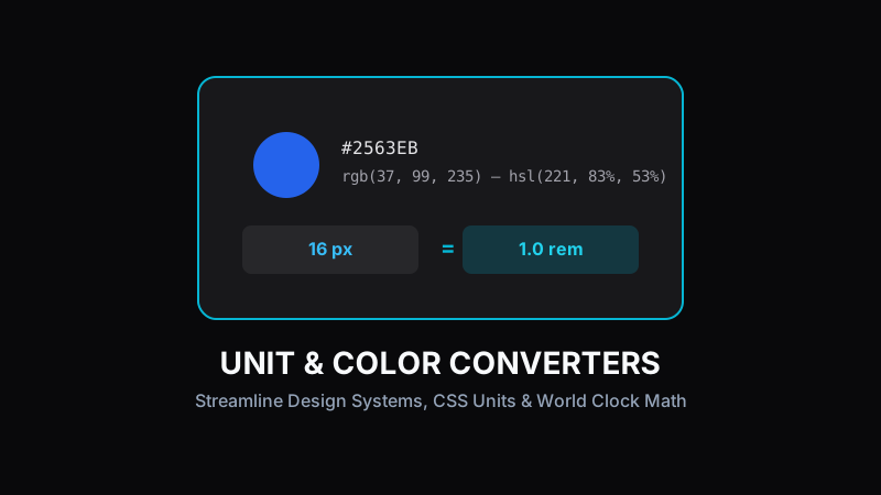
Web stylesheets typically use 6-digit HEX codes (#2563EB) or RGB function declarations (`rgb(37, 99, 235)`). However, HSL (Hue, Saturation, Lightness) format is far easier for UI designers to manipulate programmatically when crafting accessible color palettes and theme variations.
Pro Tip:
HSL makes creating dark mode color themes simple: just adjust the lightness percentage while keeping hue and saturation intact!
Responsive Web Unit Conversions (px to rem)
Hardcoding static pixel (`px`) measurements limits accessibility because user browser font size preferences are ignored. Using relative `rem` units (where 1rem = 16px root font size by default) ensures fluid responsive typography scale.
Coordinating Across Global Time Zones
Distributed remote software teams manage release schedules and client meetings across multiple international time zones. Quick time zone converters prevent scheduling confusion.
Boosting Efficiency with Converter Tools
ToolRays suite of lightweight online converters gives designers and developers instant precision calculations without interrupting creative workflow focus.
Ready to test these tools right now?
ToolRays provides fast, free, privacy-focused browser tools. No sign-up required.